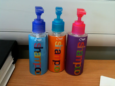
For my final major project I re branded the Wella range of products. Here is an image of my 3D mock ups thats I created for the show, unfortunalty the bottles became distorted when I soaked off the original labels from the bottles which I had purchased so the labels didn't sit as well as I had hoped on some, especially the blue labeled bottle.
Amee Ashurst
This blog is to be used as part of my unit 10, for my Graphic Design National Diploma.
Friday 18 June 2010
Resubmitting - V&A project.
Now we are nearly at the end of the coarse we have been given the chance to go back into projects to gain better and higher marks. As one of my projects that I decided to go back into I choose to go back in the V&A project. The idea I used was based on an emoticon that you use whilst texting friends or speaking on social networking sites...=], =), :) etc. This idea was to be purely type based compared to my previous design of images of an iPhone texting a friend.
Monday 14 June 2010
This is the poster that is displayed at A1 in our End of Year show for myself.
It isn't my best or favourite piece of work but I didn't have the final say to what was displayed unfortunately. This poster was made at the last minute because earlier in the first year I had created the numbers in the print room using the Letter blocks. Babs decided that they would work well in a poster so we found this book; '1000 Text Treatments' by Wilson Harvey and thought it would work well in a poster advertising that book.
It isn't my best or favourite piece of work but I didn't have the final say to what was displayed unfortunately. This poster was made at the last minute because earlier in the first year I had created the numbers in the print room using the Letter blocks. Babs decided that they would work well in a poster so we found this book; '1000 Text Treatments' by Wilson Harvey and thought it would work well in a poster advertising that book.
For my FMP (Final Major Project) for my college course I chose to rebrand the packaging for the haircare range, Wella. These here are a few mock ups that I created in Illustrator to show what the range would look like.
My designs are very typographic - inspired by the popular range by Tigi called Bedhead.
These are just a few of the vector drawings with the labels on, aswell as making up 3D mock ups on small 100ml bottles (to be displayed in the End of Year show).
Earlier on in my blog I posted quite a few posts about my type project, where I was asked to create a poster to advertise a book based on Robert Brownjohn called 'Sex & Typography'.
I'd earlier created my own type for the word 'Sex' - this was created by having a type stencil and filling it with overlapping images of stick-men having sex in various positions.
I decided to change the layout of the poster to try and gain extra marks on the typography project and to hopefully have this poster displayed in the end of year show - unfortunately it wasn't chosen to be in either the end of year booklet or the show (which is quite rubbish as its my favourite piece!)
Compared to my previous design I do prefer this one, I did this in a range, with different colours, type and layouts but this one was the best out of around nine different designs.
As we are coming to the end of the two year course we have been given the chance to go back into projects to improve our work and grades that we had achieved previously. As one of the projects we had done in the first year we did a Retro Poster project. For my original project I had used a punk theme to advertise for Rimmel London make up...in the actual project I had created a Shepherd Fairey inspired poster to advertise Smirnoff (like the Obama 'Obey' Poster). Babs had thought that this idea was a good one to develop for the end of year show and to boost my Retro Poster project grade.
I then agreed to recreate the poster and create it in a Russian Soviet style, thats why I used the style of type I have and the effects I have.
Over all I am very pleased with this outcome and quite like the effect its given the poster, it works well for Smirnoff Vodka as it is a Russian product so the Soviet theme is a very good one to use to advertise it.
As I mentioned this piece has been used in the end of year final show, one of my three pieces.
Subscribe to:
Posts (Atom)


